
Impeccable Design
Prefer to listen?
Don't worry, you're not the only one who is using AI to create your website. If you're a solopreneur or someone just getting started trying to validate your idea, you probably can't afford a great marketing team to create your website. So the first iteration is likely going to be an AI-generated affair.
The very first website design that I created was total AI slop. No shame in admitting that. That was back when everyone was super excited about creating things quickly with AI that would otherwise take weeks. The term "AI slop" hadn't been coined yet, but it was surely on the horizon.
As time went on, I started to realize how crappy my website design was, and people were telling me that it confused them. So I began iterating on it, and honestly, I am still iterating based on data. My style, taste, messaging, and branding cannot be replaced with AI if I am to expect positive results. I need to stand confident in those choices, and that means that I can't let AI hijack those choices.
But what if I don't know if I'm deluded? Well, that's where Impeccable comes in.
The missing design vocabulary for agents. Impeccable strips the AI slop tells and bad defaults out of every design discipline, from type to motion to copy. -- impeccable.style
So basically, it trains your AI agent on all the good skills that real designers use so that it can evaluate your site and tell you how to make it better. Truth be told, if you have the budget, then I still recommend that you pay a human designer, but if you don't, this is the next best thing.
Here's a preview:
- The Setup: Install Impeccable and teach it who you are and what you're building.
- Documenting what's there: Capture your current design as a baseline.
- Diagnose: Let it grade your site and find the slop.
- Fix: Work through the problems, one command at a time.
- Iterate live (optional): Fine-tune elements right in the browser.
- Polish & re-score: Smooth the rough edges and reassess your grade after changes.
Let's get started!
Step 1 - The Setup
Prerequisites
- Node.js is installed and
npxis on your path. - Your site exists in code.
- An AI agent harness is installed (Claude Code, Codex CLI, Cursor CLI, etc).
Impeccable does allow you to start from scratch, but for this tutorial, I will assume that you're starting from an existing site that you're managing with git. I created a simple, single-page, static website called "Aspen" for this exercise. You're welcome to clone it from here if you'd like.
Installation
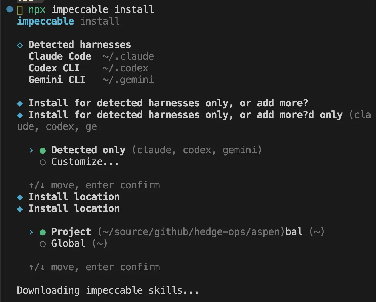
The first thing you're going to want to do is install Impeccable. If you install it globally (~), then all of your projects will have access to it. Otherwise, you may install it at the root of the repository that houses your website. Run this to install:
npx impeccable installWhen you run this, it will detect which agent you will use and install for all detected harnesses. Then it will ask if you want to use the tool just for this project locally or all projects globally. Choose which you prefer.
Initialization
/impeccable init
In your agent session, run /impeccable init, and stop!
This is the most important step. Don't click your way through this. I know you want to get to the fun, design stuff, but this is where the foundation is laid. Don't let your agent lay the foundation or you're going to be back in the slop-camp that you started in.
There is a risk that your agent will give you multiple choice questions, but resist the urge to use its choices. Instead, force yourself to write your own answer to every question. Hopefully, you've done some marketing exercises answering some of these questions already, in which case you can draw from your resources, but if you have not, then take as much time as you need to get these answers crystal clear.
For my tutorial, I asked it to not provide multiple choice answers, and this is what it asked in return:
1. Who is this for? Picture the specific person who lands on this page - what's going on in their world, and what made them come looking?

2. What is the thing, and what job does it do for them? In your own words, what does it actually help them accomplish?

3. When they leave the page, what's the one thing you most want to have happened - a concrete action, a clear understanding, or a particular feeling?
A common rookie mistake of software companies, one that I have made myself, is to cast too wide of a net. We see all the possibilities for anyone in the world to use our software so we keep the messaging vague to not push anyone away. While it's true that our total addressable market (TAM) is ginormous and that there are so many use cases for our software, the messaging ends up super vague, not speaking to anyone. Right now, you need one beachhead, the ideal customer that you want to speak to today, the one you have in mind when you're building.
Before you answer any of your agent's questions, do this fill-in-the-blank exercise as thoroughly and specifically as you can:
Our
[product/service]helps[customer segment]who want to[jobs to be done]by[verb][customer pain]and[verb][customer pain], unlike[competitor's solution].
And if you haven't validated this statement with real customer feedback, then that's your homework. Talking to as many people as possible will make this exercise much easier, so if it's very difficult, that's your signal to put the design on hold while you go set up some conversations. (Stay tuned, as this is an upcoming topic I plan to cover.)
The next round of questions my agent asked me was more tailored to my previous answers, so yours will likely be different:
Round 2 - personality and guardrails. Three questions:

1. Voice in three words. If this brand were a person talking to that stretched-thin solopreneur, how would you describe its personality? Reach for concrete, physical words ("warm and direct and unhurried") over "modern/clean."

2. References - and the specific thing about each. Name 1–3 actual sites, apps, or brands whose feel is right, and the one concrete thing each nails for you. (Equally useful: anything you've seen in this space that feels wrong - an anti-reference - and why.)

3. Accessibility bar. Any requirement to lock in (e.g. WCAG 2.1 AA contrast, keyboard nav, reduced-motion), or known user needs I should design around?
This is where your taste comes into play. Think of the adjectives that describe the vibe you want to portray.
My answers to this for my fake website, Aspen, were:
1. warm, confident, encouraging, honest
2. impeccable.style, elegant ski lodge chic, minimalist, luxury; anti-references include: loud, flashy, crowded, like salesforce.com, lattice.com
3. your recommendation
After you answer these questions, your agent is going to create a first pass at a PRODUCT.md file. This will contain information about your:
- Users
- Product purpose
- Brand personality
- Anti-references
- Design principles
Go ahead and click Yes that you want it to create that, but you better believe we're going to come back and edit that. When you click Yes, it will create another file called .impeccable/live/config.json and may update your CLAUDE.md.
When that is complete, open up your newly created PRODUCT.md file, and camp out there for a while. Go over it with a fine-tooth comb. I know, I know, you want to move on, but this is the work, y'all.
Read through every line. If you start to gloss over what you're reading, take that as a sign that it's not clear enough. Delete the line and write it in your own words. Likewise, if there's just too much information in there, delete anything that's not adding clarity, anything that's not a sharp, concise thought.
Step 2 - Documenting what's there
/impeccable document
After you complete your initialization, your agent will likely tell you that it's time to run /impeccable document. If you were starting a new project, then you would choose which direction to take your colors and styles at this point using the --seed flag. But since we're editing an existing project, your agent will read from your existing CSS and templates, and just document what's already there.
Don't worry, you aren't stuck with that design! You can say yes to it creating your DESIGN.md because it's just documenting it so that you have a starting point. It will edit this file as you go through the other steps later.
Before you move onto the next step, though, get an idea for what kind of style you want to migrate to. If you don't know what your style is, then go dig around. Find 2-3 real sites or brands that you really love and want to emulate, and find a couple more that you hate and want to avoid. You started this exercise of determining what you like and dislike when you were doing your init, so you're just refining it here.
When your agent is finished with this step, it will have written DESIGN.md and .impeccable/design.json. Then it will probably tell you to run /impeccable critique.
Step 3 - Diagnose
/impeccable critique
Moment of truth! AI is going to tell you where the AI slop is based on the documents you've created thus far. Does your site look like it should according to the documents?
Run /impeccable critique, and wait for the painful truth. It will grade you on the 10 industry standard heuristics. Here is the verdict on my fake "Aspen" website:
Design Health Score
#: 1
Heuristic: Visibility of System Status
Score: 2
Key Issue: Every CTA (Download, Get Started)
points to # - no destination, no feedback
────────────────────────────────────────
#: 2
Heuristic: Match System / Real World
Score: 3
Key Issue: Plain, human copy; the grove metaphor
is consistent and clear
────────────────────────────────────────
#: 3
Heuristic: User Control and Freedom
Score: 2
Key Issue: Anchor nav works, but the primary
action leads nowhere
────────────────────────────────────────
#: 4
Heuristic: Consistency and Standards
Score: 3
Key Issue: Internally consistent (emerald/amber, pill buttons, card rhythm)
────────────────────────────────────────
#: 5
Heuristic: Error Prevention
Score: 3
Key Issue: n/a - no forms to get wrong
────────────────────────────────────────
#: 6
Heuristic: Recognition Rather Than Recall
Score: 3
Key Issue: Clear nav labels; "Align/Guide/Partner/Network" introduced without definition
────────────────────────────────────────
#: 7
Heuristic: Flexibility and Efficiency
Score: 2
Key Issue: No skip-link; mobile nav disappears
with no replacement
────────────────────────────────────────
#: 8
Heuristic: Aesthetic and Minimalist Design
Score: 2
Key Issue: Reads generic-AI; visual treatment fights the brand you defined
────────────────────────────────────────
#: 9
Heuristic: Error Recovery
Score: 2
Key Issue: n/a - no states, but also no 404/empty handling anywhere
────────────────────────────────────────
#: 10
Heuristic: Help and Documentation
Score: 2
Key Issue: No FAQ, pricing, or support; "Free to try" unexplained
────────────────────────────────────────
#: Total
Heuristic:
Score: 24/40
Key Issue: Acceptable - works, but generic and off-brand

Anti-Patterns Verdict

Does this look AI-generated? Yes - unmistakably.
AI clearly assessed that this is unmistakably an AI-generated website. Most sites land between 20-32, so 24 isn't an absolute failure, but the verdict is that it's generic and uninspired. It goes on to say what's working, what's not working, and what the priority issues are.
My agent showed me the Priority Issues, for example, here's just one of them:
- [P1] Visual identity is generic and off-brand.
The emerald/amber emoji-grove reads as friendly-SaaS, the exact register PRODUCT.md rejects. Why it matters: a quiet-luxury audience judges credibility on craft; this looks templated.
Fix: re-skin to the ski-lodge palette (evergreen + ember on snow/wool) with the Spectral/Hanken type pairing. Command: /impeccable typeset then /impeccable colorize (or /impeccable shape for a fuller rework).
Having the exact commands to run for each problem is really useful. I like that it also tells you what's working so that you don't try to "fix" that.
It will then ask you if it can create a file called .impeccable/critique/_tmp_body.md, where it's going to track the critiques. Once it does that, it's ready to get to work, and it asks you where you want to start:
  Now, to shape the action plan:
────────────────────────────────────────────────────
←  ☐ Priority  ☐ Scope  ☐ Copy  ✔ Submit  →

The biggest finding is that the visuals (emerald/amber emoji-grove) contradict the quiet-luxury brand, while the copy is already on-voice. Where do you want to start?

1. Re-skin to the brand
Tackle the P1 visual-identity gap first: palette + type toward ski-lodge chic (evergreen/ember/snow, Spectral + Hanken). Highest-impact, biggest scope.
2. Kill the loudest tells
Quick wins first: remove the gradient headline and the emoji-card grid pattern. Smaller, fast, lowers the 'AI made this' read immediately.
3. Fix the functional gaps
Mobile nav disappearing + dead CTAs first - the P2 usability issues - before touching aesthetics.
4. Type something.
───────────────────────────────────────────────────
5. Chat about this
And hey, if you're like me, you're overwhelmed at this point, and that's okay! However you answer, you've got two ways to actually proceed:
- Jump in and start tackling it. If you say that you want to work on it, it will tell you which commands to start running.
- Tell it to create a ticket for each area of work, with enough detail and context for another agent to work on it. (This assumes that your agent has permission to create tickets in your system.)
Note that you can run critique whenever you want. It will always give you a current assessment.
Step 4 - Fix
/impeccable <refine>
So let's say that we're ready to jump in and start fixing things. For this tutorial, I'll select 1. Re-skin to the brand from Step 3's last prompt. The next thing it asks me is:
How much do you want to take on in this pass?

1. Top 3 (the P1s)
Visual identity, gradient headline, and the card grid - the three brand-defining problems.
2. Everything found
All P1s and P2s: re-skin, headline, card grid, mobile nav, dead CTAs, plus the minor a11y/contrast notes.
3. One thing at a time
Start with a single command and decide the next step after you see the result.
4. Type something.
───────────────────────────────────────────────────
5. Chat about this
I'll select 1. Top 3 (the P1s). When I selected that, it's now asking me if I want to keep the copywriting that I have in there already or change it. It's warning me, however, that the copy is the strongest part of the assessment, so it recommends that I leave it. I will agree with it and move on.
Now it's telling me what the plan is and which commands will get us there. (Get familiar with the commands available by taking a look at the docs.)
 ⏺ Locked in: re-skin to the brand, top-3 P1s only, keep the copy verbatim. Here's the plan, ordered so the new identity is established before the layout work builds on it.

Action Summary

1. /impeccable typeset - Establish the type system: Spectral (light weights) for display/headings + Hanken Grotesk for body, replacing the system-UI font. This pass also kills the gradient-clipped headline (P1 #2) - solid Charcoal Ink with emphasis via weight/size, no bg-clip-text. Copy stays word-for-word.
2. /impeccable colorize - Apply the ski-lodge palette (Aspen Evergreen + Hearth Ember on First-Light Snow / Warm Wool), retiring the emerald/amber emoji-grove and the gradient hero wash. Resolves the core P1 visual-identity gap.
3. /impeccable layout - Rework the identical six-up emoji-card grid (P1 #3): introduce asymmetry / a featured item and drop the emoji icons, so the Features section stops reading as a template. Structure and copy preserved; only arrangement and emphasis change.
4. /impeccable polish - Final pass once the three above land: tighten rhythm, focus states, hairlines, and the reduced-motion guard, and confirm the gradient/emoji/pill tells are fully gone.

(Out of scope this pass, per your call: the P2 mobile-nav and dead-CTA fixes, and any copy rewrites. They're captured in the saved snapshot for later.)

  ▎ You can ask me to run these one at a time, all
  ▎ at once, or in any order you prefer.
  ▎
  ▎ Re-run /impeccable critique after the fixes to
  ▎ see the score move off 24.

Want me to kick off /impeccable typeset now?
So I said yes and am allowing all edits. When it completes, it rebuilds the website locally, I look at the localhost preview, and it urges me to run the next command upon approval. I like the typeset changes, so I forge ahead.
This is the point at which I can request a change of direction. The typeset was good, but I already know that I'm unhappy with the colors. When it runs /impeccable colorize I will need to inspect carefully. After the typeset and coloring changes, we ended up going from this to this for the bottom half of the page:
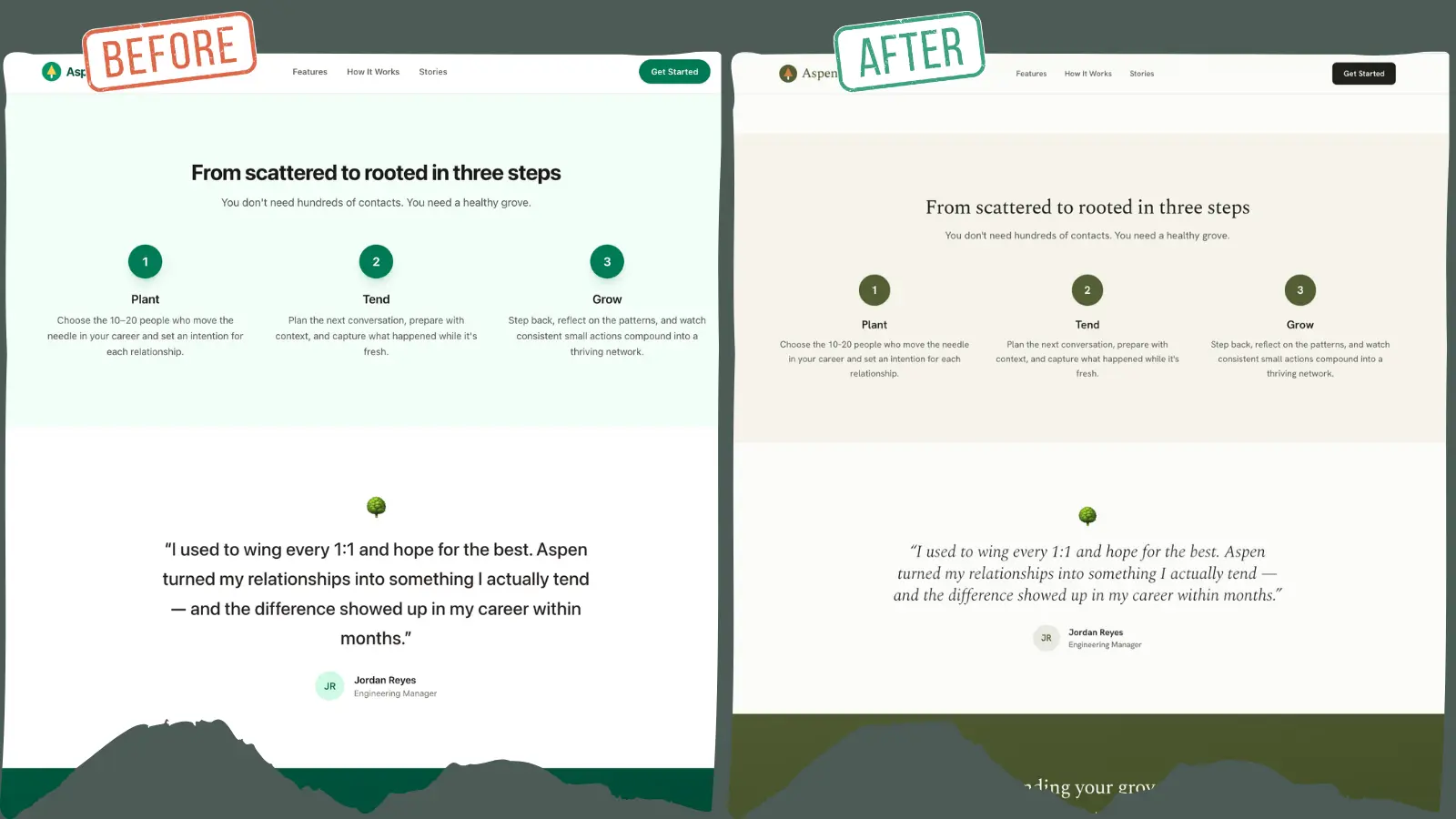
I don't hate it. We're making progress toward the chic, ski lodge vibe, so I'm going to move on and see how it plays out, saying yes when it asks Want me to run /impeccable layout?
I said yes again, and mind you, it's only fixing the top priority items, so we can see it improving little by little with each command.
Next, it wants to run /impeccable polish, and then it will be complete for this pass of things. If this were not a tutorial, then I'd keep going until the heuristics score was as high as I could get it and until I really loved it. And honestly, if we decide to change our name to Aspen, then who knows, maybe this will become a real project (if you read this far, tell me if you like the name).
The polish command leaves me with a wall of text, but it's a good statement of where we currently stand and what else is left to do:
What the polish pass added

Accessibility
- Skip-to-content link - sr-only until focused, lands on the new <main id="main-content"> landmark.
- Visible keyboard focus on every link/button (evergreen ring + offset), with a snow ring override on the ember CTA so it doesn't vanish against the dark drench.
- Decorative logos marked aria-hidden (the adjacent "Aspen" wordmark names the link).
- Anchor targets get scroll-margin-top: 5rem so the sticky header stops covering section tops on jump-nav.

Motion
- prefers-reduced-motion: reduce guard - disables smooth scroll and collapses transitions to near-instant.

The last emoji, replaced with on-brand marks
- Hero badge 🌿 → a small evergreen dot.
- Testimonial 🌳 → a centered evergreen hairline rule (echoes the feature-panel accent).
- Footer 💚 → an inline evergreen heart SVG (aria-label="love"), keeping the sentiment without an emoji.

Contrast was already verified during colorize (AA throughout); these changes don't touch text colors.

Where things stand

All three critique P1s are resolved (visual identity, gradient headline, card grid) and the polish items are closed. The page now reads as the Quiet Lodge: Spectral + Hanken type, evergreen/ember on snow/wool, an editorial Features section, and a clean a11y baseline.

Two things I want to flag honestly:
1. DESIGN.md is now stale - you had me document the old emerald/amber state as a baseline. The implementation has moved to the ski-lodge tokens in src/input.css. Worth re-running /impeccable document to capture the real, current system.
2. static/favicon.svg is likely still the old-palette mark - I didn't touch it; it'll want re-toning to match.

Still parked from the critique (out of the P1 scope you chose): the P2 mobile-nav disappearing and dead href="#" CTAs.

Suggested next

- /impeccable critique templates/index.html - re-run to see the score move off 24 now that the P1s are fixed.
- /impeccable document - refresh DESIGN.md to the ski-lodge system.
- /impeccable adapt - pick up the P2 mobile nav when ready.

Want me to re-run the critique to measure the improvement, or refresh DESIGN.md?
This is a good stopping point for the command section of the tutorial, as your agent can surely guide you from here.
Step 5 - Iterate live
/impeccable live
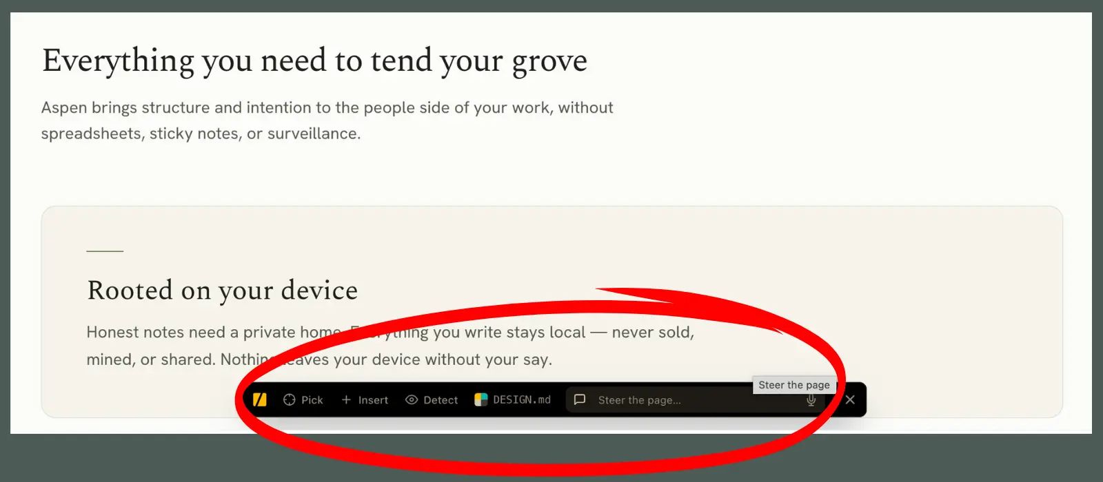
Okay, let's say you need to do some fine tuning but you need to see the changes live in order to do that. Well, that's where /impeccable live comes in.
Live mode injects a helper into the page that your browser loads. It allows you to click something (an element), choose an action to take (pick, insert, detect). If you selected pick or insert, your agent will generate three different variants that you can switch through right there so you can decide what you like best. Selecting detect will find anti-patterns.
Hot Module Replacement (HMR): If you're using a hot-reload dev server like Vite, Next, Nuxt, SvelteKit, etc, then you're golden. You just start your dev server as you normally would, then run /impeccable live. You'll open your local dev URL, and the helper will be there ready for you.
Static Site Generators (SSG): If you're like me and are on Zola, Hugo, Jekyll, Eleventy, Astro-static, or any other static-site generator, then your agent will need to do an extra step that will make it function slightly differently. This is because these dev servers serve your site from memory, not from the built files on disk where the helper gets injected. So the helper never actually reaches your browser. No big, though, just tell your agent to:
- Build the site.
- Inject the helper into the built output.
- Serve that with a plain static server.
- Run the poll loop in the background.
Then you'll just open the URL it hands you and start clicking. If you accept a change, it triggers a quick rebuild so that you can see the change.
Picking & inserting elements (HMR & SSG)
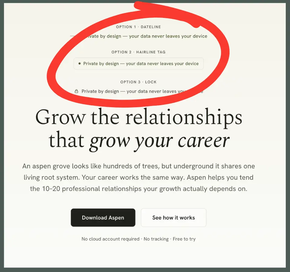
Now, you'll click the Pick or Insert button, then select the element that you want to change. Once it's selected, you type into the comment field what you want to change or what types of options you want your agent to give you.
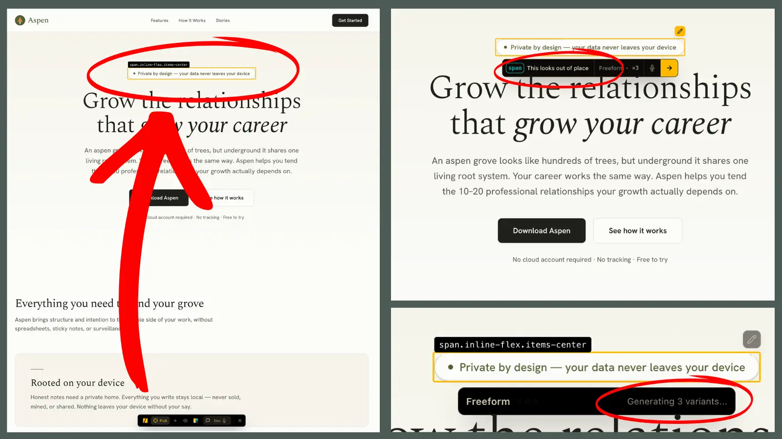
And heads up, you may want to have your browser and your agent session side by side so you can tell when it's asking you for things. I sat on this screen on the left for longer than I care to admit before I realized that the agent was asking me to proceed.
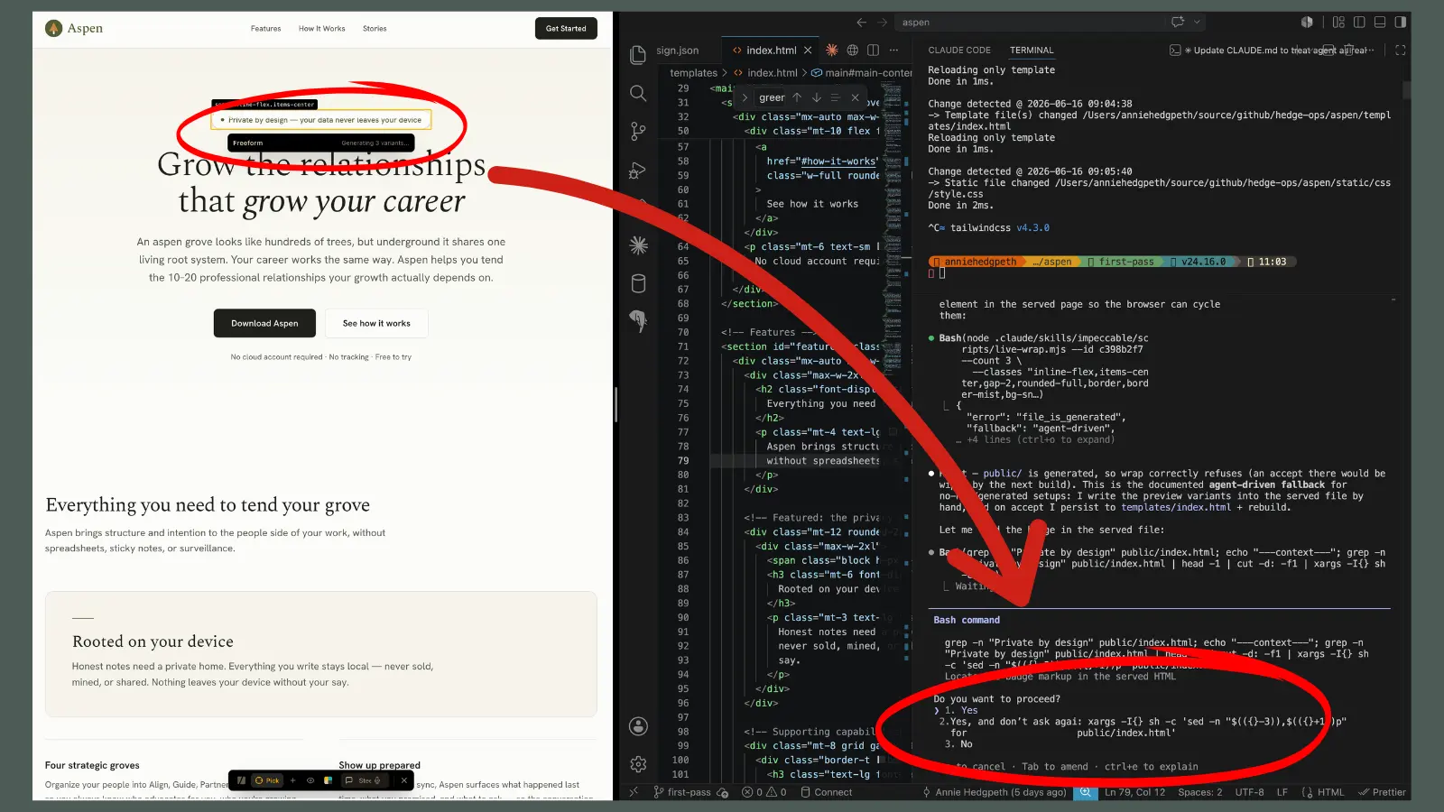
Once I told it Yes, it showed me these three options, I told the agent that I liked Option 3 the best, and it changed it for me.
I'm honestly not sure here if selecting your choice is different in an HMR environment than it is with an SSG environment, but for me, I had to tell my agent directly in the agent conversation (not the helper in the browser) which option I wanted to go with.
Honestly, I don't really like live, especially with my SSG. It's a bit kludgy, and from time to time, the helper bar just disappears. I find the picker and insert functions work sometimes and not others. I'm sure that those with HMR sites have a better time with it, but for me, I just stick to the conversational nature of working with my agent on it. And if I want to change something manually, then I update the code, look at it, and ask my agent to run another critique to make sure I didn't do something dumb.
Step 6 - Polish & re-score
/impeccable <harden>
The important thing to know with Impeccable commands is that they're meant to be executed in order. When you look at the docs, there are several sections of commands:
- Create (if you're starting from scratch)
- Evaluate
- Refine
- Simplify
- Harden
And note that they do have System commands listed at the bottom, which include document and init. But of course, those do get run in the beginning. Everything else, however, should be run in order. You don't want to harden your site if you haven't even evaluated it yet.
And theoretically your agent should be taking you through this order as well. If they're not, then familiarize yourself with it so that you can know if your agent is going rogue. You will get to a point where you're pretty happy with all of the changes that came from your critique and you will begin polishing your site. This is the fun part where you are able to smooth off any rough edges and optimize.
Once you finish with your /impeccable polish, then you can go back to the top of the command list again, and re-run /impeccable critique to see what else surfaces and what score you have now.
My guess is that it will have drastically improved and that you'll be much happier with your results.
I never actually finished the impeccable design for Aspen. However, even after just the few commands that I ran for this blog post, I was able to make marked improvements. I'd love to see your before and afters! Share them with me on socials.
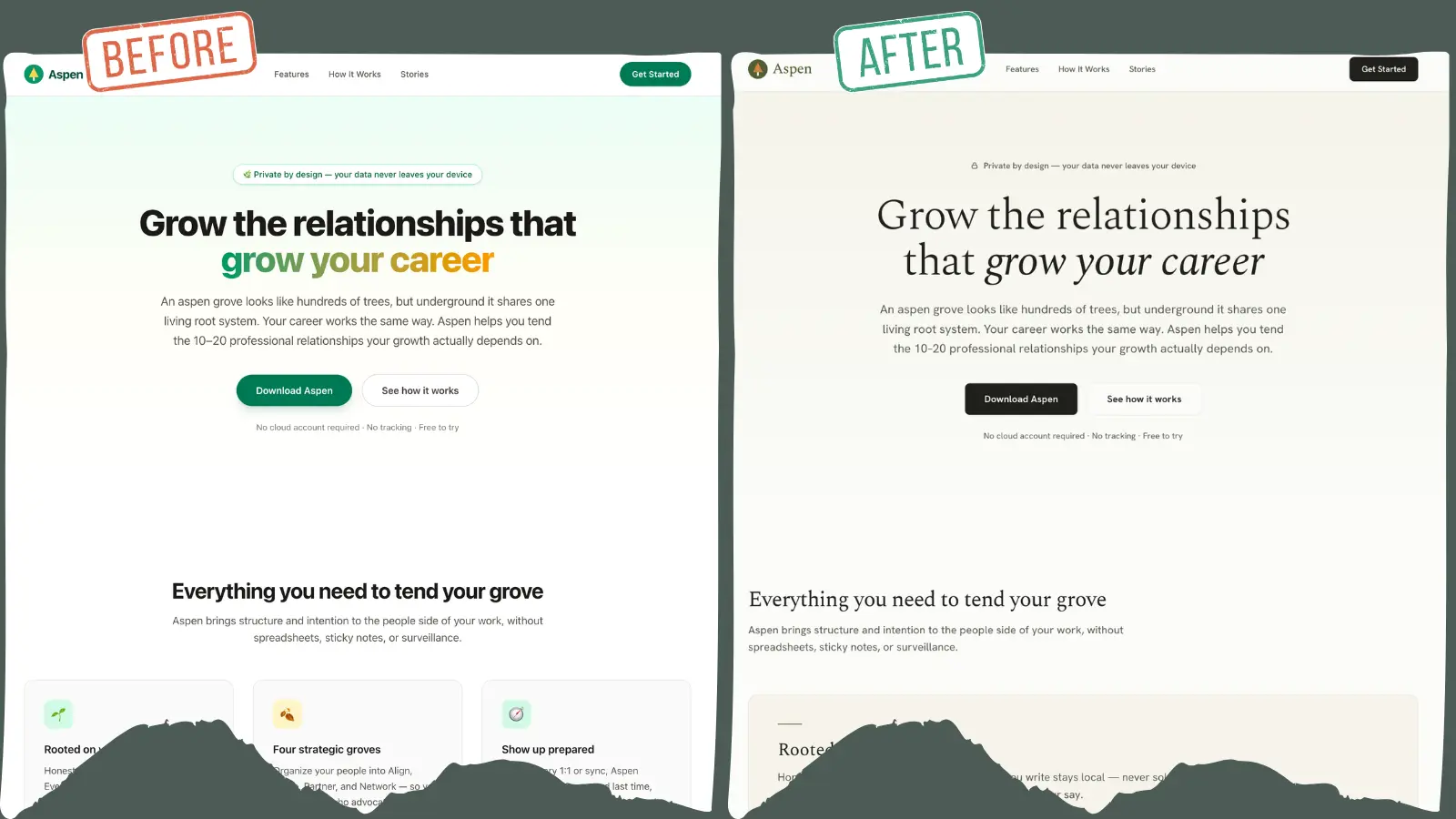
Regardless of which you like better, you can see that the one on the right has the intention of conveying the vibe of a chic ski lodge. Not so much on the left, which rather conveys, "Let's throw something up there on the internet real quick."
If you'd rather not navigate all of this on your own, get in touch. I'm happy to set up a call to see how I can help. (You can also use that link to simply ask clarifying questions about this post.)
I sincerely hope this was helpful for you. Good luck on your design journey. You got this!